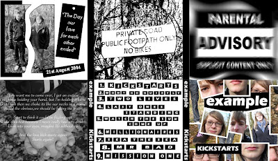
 This is the digipak following feedback I recieved. There are numerous things that I have changed compared to the previous version. Firstly, I have changed the section of the digipak that includes the 'Parental Advisory' logo. Rather than this section of the didgipak just including the plain logo, I have manipulated the image to give it a blurred effect. Furthermore, I have also added a background so that the logo merges into it. As a result of the changes, this section now appears much more proffessional and is much more visually appealing. Secondly, I have changed the section of the digipak where the CD is placed. I have once again manipulated the image in more depth to make it more interseting and more unusual.
Brief 1. A promotion package for the release of an album, to include a music promo video, together with two of the following three options: • a website homepage for the band; • a cover for its release as part of a digipak (CD/DVD package); • a magazine advertisement for the digipak (CD/DVD package). I will be creating a new music video for the artist Example and the song "Kickstarts" within the Dance Genre.
Wednesday, 30 March 2011
Digipak changed following feedback
 This is the digipak following feedback I recieved. There are numerous things that I have changed compared to the previous version. Firstly, I have changed the section of the digipak that includes the 'Parental Advisory' logo. Rather than this section of the didgipak just including the plain logo, I have manipulated the image to give it a blurred effect. Furthermore, I have also added a background so that the logo merges into it. As a result of the changes, this section now appears much more proffessional and is much more visually appealing. Secondly, I have changed the section of the digipak where the CD is placed. I have once again manipulated the image in more depth to make it more interseting and more unusual.
Subscribe to:
Post Comments (Atom)
No comments:
Post a Comment