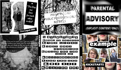
 This is the digipak following feedback I recieved. There are numerous things that I have changed compared to the previous version. Firstly, I have changed the section of the digipak that includes the 'Parental Advisory' logo. Rather than this section of the didgipak just including the plain logo, I have manipulated the image to give it a blurred effect. Furthermore, I have also added a background so that the logo merges into it. As a result of the changes, this section now appears much more proffessional and is much more visually appealing. Secondly, I have changed the section of the digipak where the CD is placed. I have once again manipulated the image in more depth to make it more interseting and more unusual.
Brief 1. A promotion package for the release of an album, to include a music promo video, together with two of the following three options: • a website homepage for the band; • a cover for its release as part of a digipak (CD/DVD package); • a magazine advertisement for the digipak (CD/DVD package). I will be creating a new music video for the artist Example and the song "Kickstarts" within the Dance Genre.
Wednesday, 30 March 2011
Digipak changed following feedback
 This is the digipak following feedback I recieved. There are numerous things that I have changed compared to the previous version. Firstly, I have changed the section of the digipak that includes the 'Parental Advisory' logo. Rather than this section of the didgipak just including the plain logo, I have manipulated the image to give it a blurred effect. Furthermore, I have also added a background so that the logo merges into it. As a result of the changes, this section now appears much more proffessional and is much more visually appealing. Secondly, I have changed the section of the digipak where the CD is placed. I have once again manipulated the image in more depth to make it more interseting and more unusual.
Magazine Advert Changed following feedback
 Following on from feedback I recieved, I changed the previous version of my magazine advert. The first change I made was to add an effect to the photograph. This simply added another feature to the advert and made it appear more proffessional. Secondly, I changed the title 'Example' by adding a blurred effect.
 Tuesday, 29 March 2011
Magazine Advertisment, First Version
 Here is the first version of my magazine advertisment. Once again, I have tryed to follow some of the conventions of my genre such as using the black and white colour scheme. In order to ensure that the magazine advert looks as proffessional as possible, I have looked at a number of existing magazine adverts and the way in which they are presented so that it is as effective as possible. I have used Adobe Fireworks to manipulate the image and change the brightness and contrast, as well as to create the text with effects such as the glow. All in all, I am happy with the magazine advert and feel that if included in a real magazine, would appeal to the target audience.
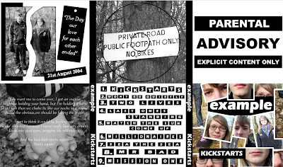
First version of Digipak
 Here is the first completed version of my Digipak. I have tryed to use the conventions from my genre, such as working with the actual CD cover to the album, as well as choosing to use the black and white colour scheme, commonly associated with the artist. I have manipulated the images by changing the brightness and contrast, editing them to produce a 'ripped' effect etc. All of the material used on the Digipak is purely my own and has been created from scratch.
Subscribe to:
Posts (Atom)